Explore our curated library of high-quality, easy-to-print kawaii coloring pages.
Kawaii (かわいい) is the Japanese word for cute — but calling it just a word misses the point entirely. Kawaii is a cultural movement. It’s an entire way of seeing the world that celebrates innocence, softness, charm, and everything small and lovable.
You’ve seen it everywhere, even if you didn’t have a name for it. That smiling sushi roll on a sticker. The cat with enormous eyes and tiny pink cheeks. The cloud with a face. That’s kawaii.
And if you’ve ever picked up a kawaii coloring page and wondered why these characters look the way they do, or which colors actually make something feel kawaii — this is the page for you. Understanding the culture behind the style makes coloring these pages a lot more fun.
What does kawaii actually mean?
The direct translation is “cute” or “adorable,” but the Japanese meaning carries more emotional weight than the English word.
Kawaii originally comes from the phrase kao hayushi (顔映し), which roughly means “face aglow” — that blushing, warm feeling you get when you see something so sweet it almost hurts. Over centuries, the word shifted from describing a feeling of tenderness and pity toward something small and helpless, to the modern meaning we know today: pure, unfiltered cuteness.
Here’s the thing that makes kawaii different from the Western idea of “cute.” In English, cute is mostly visual. Something looks cute. In Japanese culture, kawaii runs deeper than appearance. It’s about vulnerability, warmth, and emotional connection. A baby is kawaii. A clumsy puppy is kawaii. A rice ball with a shy little face drawn on it? Extremely kawaii.
The word shows up everywhere in daily Japanese life. People use it to describe food, fashion, stationery, phone cases, train station mascots, even manhole covers. By the early 1990s, researchers noted that kawaii had become one of the most commonly used words in modern Japanese.
The history of kawaii culture
Kawaii didn’t appear overnight. It has surprisingly deep roots — and a rebellious origin story most people don’t know about.
Ancient roots
The appreciation for cute, small things in Japan goes back over a thousand years. During the Heian period (794–1185), a court lady named Sei Shōnagon wrote The Pillow Book, where she described tiny, childish things as charming and endearing — essentially calling them kawaii before the modern word existed.
Even earlier, the Haniwa sculptures from Japan’s Tumulus period (250–552 CE) had those simplified, round features that feel familiar to anyone who’s seen a kawaii character today. And during the Edo era, Japanese painters were already depicting puppies and small animals with deliberately exaggerated cuteness.
So the instinct toward kawaii has been part of Japanese aesthetics for a very long time. What changed in the 20th century was the scale.
The 1970s: cute as rebellion
This is where the story gets interesting.
In the late 1960s, Japanese university students were pushing back against a rigid post-war society. While that rebellion took many forms, one of the most lasting came from teenage girls who invented a new handwriting style called maru-moji (丸文字) — literally “round writing.”
Instead of the traditional angular Japanese script, they wrote with soft, bubbly, rounded characters. They added little hearts, stars, smiley faces, and tiny drawings alongside their words. It was childlike on purpose. In a culture that expected young women to grow up fast and conform, writing like a kid was a quiet act of defiance.
Schools hated it. Many actually banned the style. Which, predictably, only made it more popular.
That small creative rebellion planted the seed for everything that followed.
Hello Kitty and the boom
In 1974, the Japanese company Sanrio introduced a character that would change everything: Hello Kitty. A simple white cat with a red bow, dot eyes, whiskers — and famously, no mouth.
That missing mouth turned out to be a stroke of genius. Without a fixed expression, people could project whatever emotion they wanted onto her. Happy, sad, calm, excited — Hello Kitty could be all of it. She became a blank canvas for feelings, which is a very kawaii concept when you think about it.
Hello Kitty merchandise started with stationery and quickly spread to everything imaginable. By 1983, she’d gone global. Sanrio followed up with dozens of other characters, and competitors like San-X created their own — Rilakkuma (the lazy bear), Sumikko Gurashi (the shy creatures who hang out in corners), Gudetama (the depressed egg).
If you enjoy coloring Sanrio characters, we have pages for Hello Kitty, Kuromi, My Melody, and more Sanrio favorites.
Kawaii goes global
Through the 1990s and 2000s, kawaii culture spread worldwide on the back of Pokémon, anime, and manga. These weren’t marketed as “Japanese cute” — they were just designed to be universally appealing, with big eyes, round faces, and expressive features that connected with kids (and adults) in every country.
In 2014, the Collins English Dictionary officially added “kawaii” as an entry, defining it as a Japanese artistic and cultural style emphasizing cuteness with bright colors and childlike characters.
Today, kawaii is a global industry worth billions. It shapes fashion (Harajuku street style, Lolita fashion), food (character bento boxes, themed cafes), technology, home goods, and of course, art and coloring.
What makes something look kawaii?
If you’ve spent any time with kawaii coloring pages, you’ll start to notice patterns. Kawaii characters all follow a set of visual rules — and once you see them, you can’t unsee them.
Round shapes everywhere. No sharp angles, no harsh edges. Heads are circles or ovals. Bodies are soft and rounded. Even supposedly angular objects like books or buildings get rounded corners in kawaii style.
Big eyes, tiny (or no) nose, small mouth. The eyes do all the heavy lifting in a kawaii face. They’re oversized compared to the head, usually with a shiny highlight dot that makes them look alive. The nose is either a tiny dot or completely absent. The mouth is small and simple — often just a short line or a little “w” shape.
Chibi proportions. Kawaii characters are usually drawn about two to three heads tall. That means the head takes up a third to half of the entire body. This exaggerated proportion triggers the same “aww” response we have toward babies and baby animals — big head, small body, helpless and lovable.
Blush marks. Those little pink circles or ovals on the cheeks? They’re a kawaii signature. Almost every kawaii character has them. They suggest warmth, shyness, and emotional softness.
Faces on everything. One of the most distinctly kawaii things is giving faces and personalities to objects that shouldn’t have them. A smiling donut. A cloud with sleepy eyes. A cactus waving at you. This transforms ordinary things into characters, and characters into friends.
Thick, clean outlines. Kawaii art uses bold black outlines that make shapes easy to read at a glance. This is also what makes kawaii so well-suited to coloring pages — those clean lines create satisfying spaces to fill.
If you’re new to kawaii coloring and want to start with something simple, our easy kawaii coloring pages have bold outlines and big shapes that are perfect for beginners. For more of the chibi style, check out our chibi coloring pages.
Kawaii colors: the palettes that define the style
This is where things get practical. Color choice is probably the single biggest factor in making a finished coloring page feel authentically kawaii — and it’s simpler than you might think.
Why pastels are the default
Kawaii gravitates toward soft, muted tones. Not washed out, not pale to the point of invisible — just gentle. Think of the difference between a fire truck red and a strawberry milkshake pink. Both are technically “red family,” but only one of them feels kawaii.
Pastels work because they match the emotional tone of the whole style. Kawaii is about softness, warmth, and approachability. Bold, saturated colors feel aggressive by comparison. Pastels feel like a hug.
The single most associated kawaii color is pink — specifically a warm, soft pink. Not hot pink, not magenta. The kind of pink you’d see on cherry blossoms or the inside of a seashell.
That said, kawaii isn’t limited to pastels. Different kawaii sub-styles use very different palettes. Here are six to keep in your back pocket.
Six kawaii color palettes you can use right now
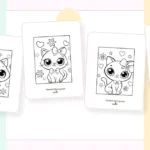
Classic kawaii pastels — Soft pink, baby blue, lavender, mint green, butter yellow, peach. This is the go-to palette for most kawaii coloring. It works for animals, characters, everyday cute things. When in doubt, start here.
Sakura (cherry blossom) — Blush pink, white, soft rose, pale green. A minimal palette inspired by spring in Japan. Beautiful for nature scenes, gentle characters, and anything that should feel calm and delicate.
Yume kawaii (dreamy) — Lilac, periwinkle, cotton candy pink, cloud white, soft gold. “Yume” means dream, and this palette feels like one. Use it for unicorns, mermaids, fantasy creatures, and anything magical.
Kawaii food — Warm peach, strawberry pink, cream, chocolate brown, matcha green, caramel. Warmer and slightly richer than the classic palette, because food pages need to look appetizing. Great for boba tea, desserts, fruit, and breakfast scenes.
Creepy kawaii — Dusty purple, muted teal, deep burgundy, charcoal, bone white. This one breaks the pastel rule on purpose. Creepy kawaii (also called guro kawaii) is all about mixing cute faces with dark, moody surroundings. The contrast is the whole point.
Bold kawaii — Coral, turquoise, sunny yellow, hot pink, lime green. For when you want energy over softness. This palette works for rainbow pages, summer themes, and any design where the character is already bursting with personality.
| Palette | Colors | Best for |
| Classic kawaii pastels | Soft pink, baby blue, lavender, mint green, butter yellow, peach | The go-to for most kawaii coloring — animals, characters, everyday cute things. When in doubt, start here. |
| Sakura (cherry blossom) | Blush pink, white, soft rose, pale green | A minimal palette inspired by spring in Japan. Beautiful for nature scenes and anything that should feel calm and delicate. |
| Yume kawaii (dreamy) | Lilac, periwinkle, cotton candy pink, cloud white, soft gold | “Yume” means dream, and this palette feels like one. Perfect for unicorns, mermaids, and anything magical. |
| Kawaii food | Warm peach, strawberry pink, cream, chocolate brown, matcha green, caramel | Warmer and richer than the classic palette, because food pages need to look appetizing. Great for boba tea, desserts, and fruit. |
| Creepy kawaii | Dusty purple, muted teal, deep burgundy, charcoal, bone white | Breaks the pastel rule on purpose. Creepy kawaii is all about cute faces in dark, moody surroundings. The contrast is the whole point. |
| Bold kawaii | Coral, turquoise, sunny yellow, hot pink, lime green | For when you want energy over softness. Works for rainbow pages, summer themes, and characters bursting with personality. |
Picking colors for a coloring page
A few practical tips that make a big difference:
Stick to three to four colors per page. That’s usually one dominant color for the main character, two to three accent colors for details and accessories, and the black outlines holding it all together. More colors than that and the page starts to feel chaotic instead of cute.
Keep faces high-contrast. Light body or skin color, dark bold eyes, and pink cheek blush. The face is what makes it kawaii, so it needs to pop.
Don’t feel like you have to fill every space. Leaving some areas white creates breathing room and actually makes the colored parts stand out more.
For a full walkthrough on techniques — layering, shading, which supplies to use — we have an entire guide on how to color kawaii.
The many flavors of kawaii
Kawaii isn’t one single look. Over the decades, it’s branched into distinct sub-styles, each with its own vibe and visual language.
Yume kawaii means “dreamy cute.” Picture fairy tales, pastel rainbows, and soft sparkles. It’s the most ethereal branch of kawaii — gentle, floaty, and a little bit magical. If you like coloring unicorns and mermaids, this is your style.
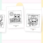
Guro kawaii flips the script. “Guro” comes from “grotesque,” so this style mashes up cute faces with dark, creepy, or unsettling surroundings. Think adorable skulls, smiling ghosts, cute characters in haunted settings. It’s strange and charming in equal measure. Our creepy kawaii coloring pages and goth kawaii pages live here.
Kimo kawaii translates to “gross cute” or “creepy cute.” Characters in this style are deliberately a little ugly or weird — but in a way that loops back around to being endearing. Gudetama, the lazy egg who can’t be bothered to do anything, is a good example.
Deco kawaii is maximalist kawaii. More stickers, more sparkles, more layers of cuteness piled on top of each other. Nothing is too much. If you like detailed, busy designs, our doodle coloring pages capture this energy.
Chibi is both a sub-style and a drawing technique. Characters are drawn super-deformed — huge heads, tiny bodies, minimal detail — to maximize the cute factor. It’s the most recognizable kawaii art style worldwide. Explore our chibi coloring pages if this is your thing.
Frequently asked questions
What does kawaii mean in English?
Kawaii is the Japanese word for cute or adorable. But in practice, it describes an entire cultural aesthetic built around innocence, charm, softness, and playfulness. It’s less about how something looks and more about the warm feeling it gives you.
What are kawaii colors?
Kawaii colors are typically soft pastels — baby pink, lavender, mint green, butter yellow, sky blue, and peach. These gentle tones match the emotional warmth of the kawaii style. Different sub-styles use different palettes, from dreamy lilacs to dark creepy-kawaii purples.
Is kawaii just for kids?
Not even close. In Japan, kawaii culture spans every age group. Adults collect kawaii stationery, wear kawaii fashion, decorate their homes with kawaii items, and use kawaii coloring as a legitimate stress-relief and mindfulness activity. Our kawaii coloring pages for adults are designed with more detail and complexity for grown-up colorists.
What’s the difference between kawaii and chibi?
Kawaii is the broad cultural concept — the whole world of Japanese cuteness. Chibi is a specific art style within kawaii where characters are drawn with exaggerated proportions: oversized heads, tiny bodies, usually standing about two to three heads tall. All chibi is kawaii, but not all kawaii is chibi.
How do I start coloring in kawaii style?
Grab a free kawaii coloring page, pick three to four pastel colors, and start with the face — bold dark eyes with a white highlight dot, soft pink cheek blush, and a tiny mouth. Work outward from there with light, gentle color. For a complete walkthrough, see our how to color kawaii guide.
Start coloring
Now you know the story behind the style — where it came from, why it looks the way it does, and which colors bring it to life.
Time to pick up some pencils.
Browse our full collection of kawaii coloring pages or grab a ready-made kawaii coloring book with our favorite pages bundled together. And if you want a quick-reference color guide you can keep next to your desk, sign up below to get our free kawaii color palette cheat sheet as a printable PDF.