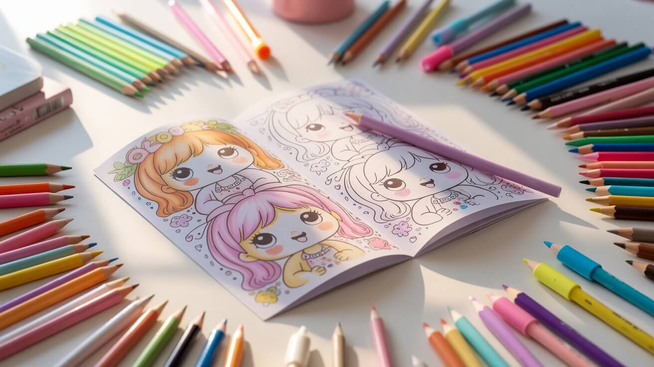
Explore our curated library of high-quality, easy-to-print kawaii coloring pages.
Kawaii coloring pages look simple. Round shapes, big eyes, clean outlines — how hard can it be?
Harder than you’d think. Or more accurately, there’s a real gap between a kawaii page that looks “colored in” and one that looks kawaii. The difference comes down to a few techniques that are easy to learn once someone actually shows you.
That’s what this page is for. We’ll cover the supplies that work best, a step-by-step process you can follow on any kawaii coloring page, theme-specific tips for animals, food, fantasy, and creepy kawaii — and the most common mistakes that kill the kawaii vibe (plus how to fix them).
Grab one of our free kawaii coloring pages and follow along. It’s easier to learn by doing.
What you need: kawaii coloring supplies
You don’t need to spend a lot. You just need to pick the right tool for the look you want.
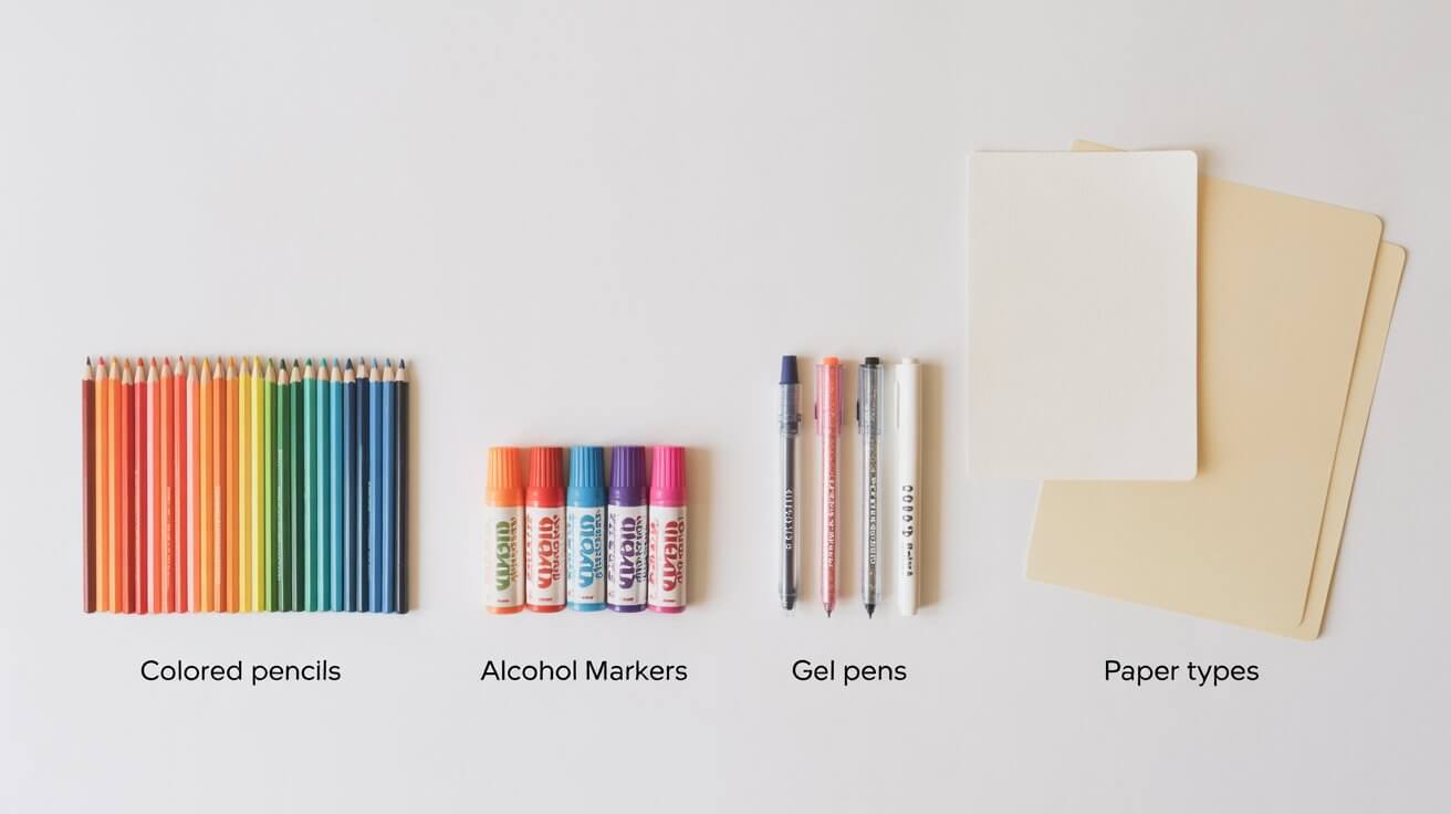
| Supply | Best for | Top pick | Budget pick |
| Colored pencils | Beginners, soft gradients, detailed work | Prismacolor Premier | Crayola Twistables |
| Alcohol markers | Bold color, smooth coverage, blending | Copic Sketch | Ohuhu dual-tip |
| Water-based markers | Softer look, kid-friendly, forgiving | Tombow Dual Brush | Crayola SuperTips |
| Gel pens | Sparkle accents, eye highlights, details | Sakura Gelly Roll (white + glitter) | Any metallic gel pen set |
| Paper | Depends on your medium (see below) | X-Press It Blending Card (markers) | 32lb cardstock (all-purpose) |
Colored pencils: the easiest starting point
Colored pencils are ideal for kawaii because the whole style relies on soft, gentle color — and pencils give you complete control over pressure. Light pressure gives you pastels. Slightly more pressure builds depth. You’re never committed to a color you can’t layer over.
Prismacolor Premier pencils have a soft, waxy core that lays down rich pigment and blends smoothly. Faber-Castell Polychromos are oil-based and less waxy, which some people prefer for fine details. If you’re just getting started or coloring with kids, Crayola Twistables are surprisingly good — they naturally lay down soft color, they don’t need sharpening, and they’re cheap enough that nobody panics when one goes missing.
The one rule with pencils and kawaii: use light pressure. You can always add more. You can never take it away.
Markers: when you want bold and vibrant
Alcohol markers like Copic and Ohuhu give you that smooth, streak-free coverage you see in professional kawaii art. They blend into each other beautifully, which makes gradients effortless. The downside is they bleed through thin paper, so you need the right stock (more on that below).
Water-based markers like Tombow Dual Brush pens are more forgiving. They don’t bleed as aggressively, the colors are softer by nature, and they’re easier for kids to use without ruining the page underneath.
Budget option: Crayola SuperTips. Thin enough for small areas, broad enough to fill bigger ones, and the color range is surprisingly decent for kawaii work.
Gel pens: your secret weapon
Gel pens aren’t for coloring entire areas — they’re for the finishing touches that make everything pop.
A white gel pen (Sakura Gelly Roll is the standard) is the single most useful kawaii tool you can own. That tiny white highlight dot in the eyes? White gel pen. A small shine line on a bow or a bubble? White gel pen. It turns flat coloring into something that looks alive.
Metallic and glitter gel pens are great for stars, hearts, small decorative accents, and anything that should feel a little bit magical. Use them sparingly. A few strategic sparkles look intentional. Sparkles everywhere look like a craft store exploded.
Paper matters more than you’d think
| Medium | Paper to use | Why |
| Colored pencils, crayons | Standard 20lb printer paper | Pencils don’t bleed, so regular paper works fine |
| Water-based markers | 32lb paper or light cardstock | Prevents minor bleed-through and feathering |
| Alcohol markers | Dedicated marker paper or X-Press It Blending Card | Smooth surface prevents streaks; thick enough to stop bleed-through completely |
All of our coloring pages at KawaiiColoring.com are formatted for both US Letter and A4 paper. If you’re using markers, just print onto your heavier stock instead of regular printer paper.
Kawaii coloring techniques: step by step
This process works on any kawaii coloring page — animals, food, characters, fantasy creatures, all of it. Five steps, same order every time.
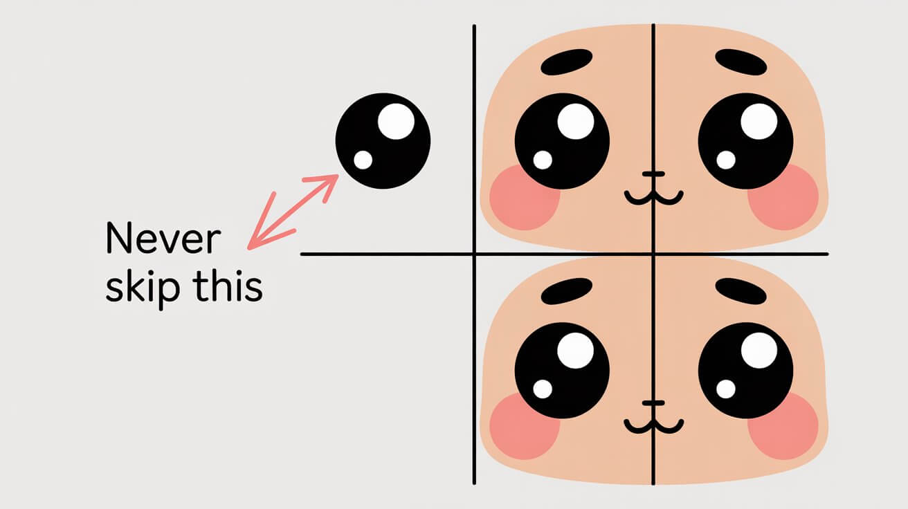
Step 1: Start with the face
The face is what makes it kawaii. Everything else is secondary. Color it first while your hands are steady and your page is clean.
Eyes — fill them in with black or very dark brown, but leave a small white circle or dot uncolored. This is the highlight, and it’s non-negotiable. That tiny white spot is the difference between eyes that look alive and eyes that look like two dark holes. If you accidentally fill it in, add it back with a white gel pen.
Cheeks — soft pink or peach blush marks, always. With pencils, use very light circular motions. With markers, one quick light pass — don’t go back over it or it’ll get too dark. The blush should look like a gentle glow, not a sunburn.
Mouth — usually just a tiny line, a small curve, or a little “w” shape. Leave it uncolored or use a very subtle color. Don’t overthink this one.
Nose — most kawaii characters don’t have one. If there is a nose, it’s a tiny dot of light pink or brown. One touch and move on.
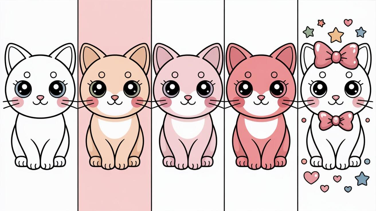
Step 2: Block in your base colors
Now fill the main body areas with your lightest color. If the character is pink, use the lightest pink you have. If it’s a blue bunny, start with baby blue. You’re laying the foundation, not finishing.
The key principle: work light to dark. You can always go darker on the next pass. You cannot go lighter without starting over.
Use one color per area at this stage. Don’t blend yet, don’t shade yet. Just fill. With pencils, keep the pressure gentle and even. With markers, lay down a single smooth coat — move quickly and don’t let the ink puddle.
Don’t worry about being perfectly inside the lines. Kawaii is a forgiving style. Those thick black outlines are doing a lot of the work for you.
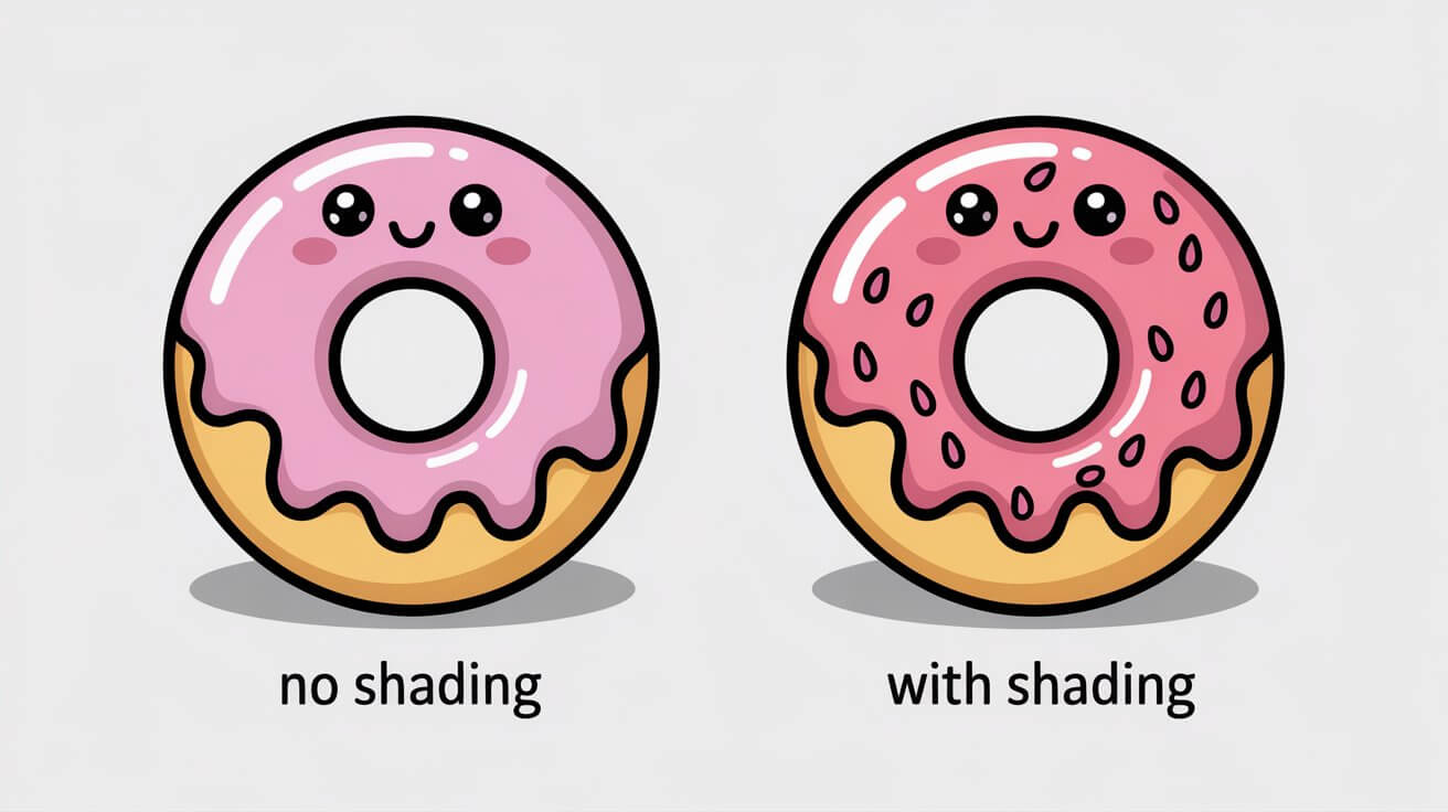
Step 3: Add shading and depth
This is the step that separates “colored in” from “actually looks good.”
Look at your character and think about where shadows would naturally fall: under the chin, below the ears, behind bangs or hair, the bottom edge of round shapes, the underside of arms or legs. These are the areas that get a second, slightly darker layer.
| Your base color | Shadow color to layer on top |
| Light pink | Medium pink or dusty rose |
| Baby blue | Medium blue or periwinkle |
| Butter yellow | Warm gold or soft peach |
| Mint green | Medium sage or soft teal |
| Lavender | Medium purple or soft plum |
| Cream/white | Very light gray or pale peach |
With colored pencils, build the shadow gradually with light overlapping strokes. Concentrate the pressure in the darkest area and feather outward into the base color. It should look like a gradient, not a line.
With markers, lay the darker shade into the shadow area while the base coat is still slightly wet. The two colors will bleed into each other and create a smooth transition. If the base has already dried, use a colorless blender marker to soften the edge.
For kawaii food specifically, add a darker edge along the bottom curve of round shapes — donuts, cupcakes, boba cups, fruit. This creates a plump, 3D effect that makes the food look delicious and touchable.
Step 4: Add highlights and sparkle
Now bring out the white gel pen.
Add a small dot or short line to the eyes (if you didn’t leave a white space in step 1). Add a tiny shine mark on anything that should look glossy — bows, gems, bubbles, candy, the surface of a boba cup.
For hair or fur, leave a few small areas uncolored or very lightly colored to suggest natural highlights. You don’t need to add white — just let the paper show through where light would hit.
Glitter gel pens go on stars, hearts, and small decorative elements around the character. Not on the character itself (usually). Think of sparkle as seasoning — a little goes a long way.
Step 5: The background — or not
Plenty of kawaii coloring pages look best with no background color at all. A white background lets the character be the star, and the contrast with the pastel coloring makes everything feel clean and bright.
If you do want to color the background, keep it very light. A single soft wash of one pale color works better than a detailed background. The background should never compete with the character.
The decorative elements around the character — stars, hearts, clouds, sparkles — can use accent colors from your palette. Pick two at most and keep them consistent.
For palette inspiration, see our guide to kawaii colors and palettes.
Tips for specific kawaii themes
The basic process above works for everything, but certain themes have their own tricks.
Kawaii animals
The biggest mistake with animals is coloring fur as a flat, solid block of color. Kawaii animals look better when the fur has a little texture — use light, feathery strokes with pencils rather than heavy flat fills.
Every kawaii animal should have pink inner ears and pink cheek blush, regardless of the animal’s actual color. A blue bear still gets pink ears. A green frog still gets pink cheeks. That’s the kawaii formula.
Eyes should be disproportionately large compared to the face, and that white highlight dot matters even more on animals than on human characters. It’s what makes them look alive instead of stuffed.
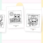
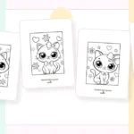
Browse our full kawaii animal coloring pages — the cat pages are a great place to practice since cats have the most iconic kawaii face shape.
Kawaii food
Food coloring is all about restraint. Keep the base color of each food item simple and uniform — one solid tone for the body. All the visual interest comes from two places: a slightly darker shade on the bottom edge (for 3D roundness) and colorful toppings or decorations.
Sprinkles, toppings, berries, and small decorations are your chance to use 2–3 accent colors. These tiny details are what make food pages fun to color.
The face on food needs to contrast strongly with the food’s color. A strawberry’s face needs to read clearly against the red. Use very dark eyes and keep the mouth area light. If the food is very dark (like a chocolate item), consider making the face area slightly lighter during the base coat.
Try our kawaii food coloring pages — the boba tea pages are especially satisfying because the bubbles give you lots of small areas to fill with different accent colors.
Kawaii fantasy creatures
This is where gradients really shine. Unicorns and dragons look incredible with a gentle pastel rainbow transition across the body — pink fading into lavender fading into baby blue. With pencils, overlap the colors where they meet and use light pressure so they blend together. With markers, work wet-into-wet to get smooth transitions.
Mermaid tails are perfect for two-color gradients. Teal fading into purple, or pink fading into coral. The key is keeping the transition gradual, not a hard line where one color stops and another starts.
Wings, horns, and magical accessories — this is where metallic and glitter gel pens earn their keep. A few strategic sparkles on a unicorn horn or fairy wings instantly sell the magic.
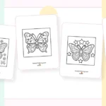
Explore our unicorn coloring pages and dragon coloring pages to practice these techniques.
Creepy kawaii
Creepy kawaii flips the color rules on purpose. Instead of pastels, reach for dusty purples, muted teals, charcoal grays, and deep burgundy. The palette should feel moody and atmospheric.
But — and this is the important part — keep the faces cute. Big eyes, blush marks, tiny mouth. The contrast between a sweet face and a dark, spooky surrounding is exactly what makes creepy kawaii work. If both the face and the background are dark, you just get “creepy” without the “kawaii.”
Dark backgrounds or washes behind the character amplify the vibe. Try coloring the background in a deep purple or charcoal and leaving the character in slightly brighter (but still muted) tones so they stand out.
Our creepy kawaii coloring pages and goth kawaii pages are designed for exactly this treatment.
Kawaii coloring for different skill levels
For kids and beginners
Start with easy kawaii coloring pages — they have big bold outlines, large areas to fill, and fewer tiny details.
Use crayons or thick markers. They’re forgiving, they fill space quickly, and they don’t require any special technique to look decent. Crayola Twistables or SuperTips are both solid choices for kids.
The most important advice: don’t stress about staying in the lines. Kawaii is the most forgiving art style on the planet. Those chunky outlines do 80% of the work. If a kid colors the whole thing in three colors and scribbles on the cheek blush, it’ll still look cute. That’s the beauty of it.
For adults and advanced colorists
If you’re looking for a challenge, try our kawaii pages for adults or the doodle kawaii pages — these have intricate patterns, more complex scenes, and smaller details that reward careful technique.
Mixed media is where things get really interesting at this level. Try laying a base coat with colored pencils, adding crisp detail lines with fine-tip markers, and finishing with white and metallic gel pen highlights. Each medium handles a different job, and together they create depth that a single tool can’t match.
One technique worth trying: color-by-mood. Before you start, pick a feeling — calm, energetic, melancholy, playful — and choose 3–4 colors that match that emotion. Let the palette reflect how you’re feeling rather than what the character “should” look like. A blue cat with lavender cheeks might not be realistic, but in kawaii, it’s perfect.
Common kawaii coloring mistakes
Five things that kill the kawaii vibe, and how to fix each one
| Mistake | What it looks like | The fix |
| Too many colors | Page feels chaotic and busy instead of cute | Stick to 3–5 colors max. One dominant, two to three accents. |
| Pressing too hard | Colors look flat, saturated, and heavy — loses that soft kawaii feel | Light pressure always. You want pastel, not poster paint. Build slowly. |
| No eye highlight | Eyes look dead and flat — two dark circles instead of sparkly kawaii eyes | Leave a white dot when coloring eyes, or add one later with a white gel pen. |
| Re-outlining in dark pencil | Kills the softness — looks heavy-handed and loses the clean kawaii look | Trust the printed black outline. Don’t trace over it with colored pencils. |
| Skipping the cheek blush | Character looks plain and emotionless, missing warmth | One light circle of pink on each cheek. Takes two seconds. Changes everything. |
Frequently asked questions
What are the best colors for kawaii coloring pages?
Soft pastels are the default — baby pink, lavender, mint green, sky blue, butter yellow, and peach. For food themes, go warmer with strawberry pink, cream, and matcha green. For creepy kawaii, break from pastels entirely and use dusty purples, muted teals, and charcoal. Our kawaii colors and palettes guide has six complete palettes with specific use cases.
Can adults enjoy kawaii coloring?
Absolutely. Kawaii coloring is popular with adults worldwide as a mindfulness and stress-relief activity. The simple, rounded shapes are calming to work with, and the creative decisions around color and shading keep your brain engaged without overwhelming it. We have coloring pages designed specifically for adults with more detail and complexity.
What paper should I use for kawaii coloring pages?
It depends on your coloring medium. Regular 20lb printer paper is fine for colored pencils and crayons. For water-based markers, use 32lb paper or light cardstock. For alcohol markers, you want dedicated marker paper or blending card for the smoothest results. Our pages print on both US Letter and A4 paper.
How do I make kawaii eyes look shiny?
Leave a small white circle or dot uncolored when you fill in the eyes. If you accidentally fill it in, add the highlight back with a white gel pen (Sakura Gelly Roll is the standard). That single white dot is the most important detail in kawaii art — it’s what makes the eyes look alive.
What’s the easiest kawaii coloring page to start with?
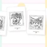
Kawaii food pages are the most beginner-friendly. The shapes are simple rounds and ovals, the faces are straightforward, and you can get a great result with just two or three colors. Kawaii animal pages with bold outlines are another good starting point. Check out our easy kawaii coloring pages for pages designed specifically for beginners and kids.
Start coloring
You’ve got the supplies, the technique, and the tips. Now it’s about practice.
Download a free kawaii coloring page and work through the five steps. Face first, base colors, shading, highlights, background. The first page teaches you more than reading ever will.
If you want a curated set to work through, our kawaii coloring book bundles our favorite pages together — it’s a great way to practice across different themes without having to pick and choose.
And when you finish something you’re proud of, share it with us. Tag your work with #KawaiiColoring — we’d love to see what you create.